
George Hulbert was chuffed to be asked to give a guest lecture to the Auckland University of Technology (AUT) PR & Communications course recently. The topic: Communicating Complex Information. Sounds hard? Here are three tips that help George to make it easier:

Life is complex, right? From the moment you wake up, switch on your black mirror and allow yourself to be bombarded with information, you stagger into a blizzard of information and choices. Then you go into the bathroom and turn on the radio: news, ads, choices, pressure. Perhaps some TV with your breakfast? More of the same.
And then it just gets worse as you go out into the world of cars, buses, trains and stress: off to work, out into a world of choices, information, decisions - complexity.

What is our job?
Amid this maelstrom of madness, our job as communicators is to help people and organisations to do one thing: to be a laser, shining sharp light precisely in the areas of our message in order to engage and cut through the clutter.
So, how?

I love this image, because it says it just right. This is your old mate Albert Einstein, who famously said:
“If you can’t explain it simply, you don’t understand it well enough”
If you can't explain 'it' to a child, you're making things too complex. And, to adapt this to 2018, if you can't explain it simply, how can you expect to get your point across on Twitter, through social media, in video, in an infographic, or via the media?
So, how?
Tip 1: MAKE it simple
This sounds blindingly obvious, but when things are complex YOU have the choice - you can strip away the detail to get to the core of the information, the key message and story. we like to think about two things:
1. Don't show everything. You may be given a stack of information, but maybe only one number in it is relevant - so only show that one
2. Take the information apart. Strip it down, separate it out, sift it through - which details sit under which broader headings?
It's like the puzzle at the top of this article - individual pieces of information that you can use to create a coherent picture.
Ask yourself the following questions:
- What does the audience NEED to know?
- What do they NOT need to know?
- What do you want people to DO?
- WIIFM?
- Does this information fit under any heading
Tip 2: Focus on your message
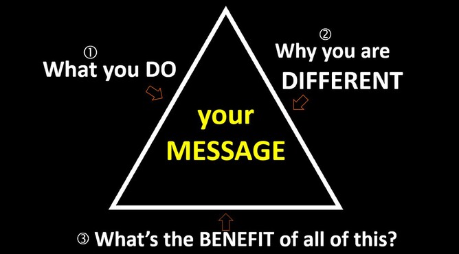
I use a triangle to help me, because it helps me to separate out core blocks of message and ultimately to arrive at the core point of the exercise: to understand the benefit of the thing you are communicating:
What does xyz ACHIEVE for your customer?
If you can understand that, and detail how you do it, then you not only have a compelling message to offer, but you then have opportunities to prove how you do it - all useful ingredients in the communications recipe book.
Example: a home loans provider I know does this well. When asked what she does, instead of saying "I sell home loans" she says "I help people to save ten years and $200,000 off their mortgage". Got your attention? It got mine. And then you really want to know how she does it. Great messaging, because you are engaged, thirsty for more information. Very elegant.
Tip 3: Build a world of content around your offer
Once you have stripped away the dross and focused on your message, gathering key points along the way, then you need to show it in bite-sized chunks to your audience.
I call this building a world of content around your offer.
So many studies have been written about how many times people need to see your brand in order to act. I say 'give people many different ways to see your brand' - never just sell. Tell, tell, tell and sell. Allow people to see your authenticity; show them the many facets of your brand and offer:
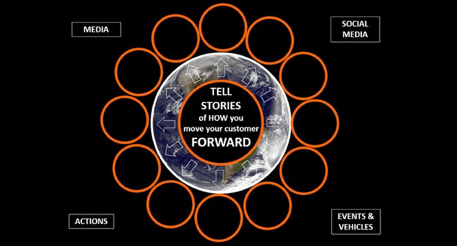
Use the channels at your disposal: media, social media, inbound marketing, automation, events, thought leadership, white papers, newsletters, EDMs: the world is awash with opportunities for you to tell your stories simply and well.
And BE VISUAL
Pictures, video, infographics: when was the last time you clicked on content that did NOT have an image in it?
Get visual if you want to communicate complex information well. Just think about people who do this well. My go-to? It's so much part of our lives it's easy to miss, but airline safety cards are masterful in this area:
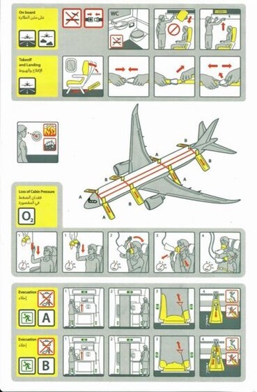
Hugely complex information distilled into something a child can use, even when under pressure.
And, as for real class in visual communication of incredible complexity, distilled down to messages of simplicity - even beauty - for me the leader is still NATS. Not new, not event recent, but still the leader in super-powerful communication of wildly complex information. Just imagine the data that site behind this visualisation (click on the image below to make it run):

So, to recap:
1. MAKE it simple
2. Focus on your message
3. Create a world of content around your offer - as visual as possible.
Simple.